Saturday, August 25, 2012

Murals and More

So I have always wanted to paint either a mural, french scenic style, or wallpaper, chinoiserie!  I am motivated right now to try this so here I go.  I am leaning toward painting the wallpaper, rather than  mural right on the wall,  which would push me to work our the design on tracing paper first.  I would love to also paint onto tea paper, but that would require additional steps and research, and I am anxious to get painting!  So, to get inspired.....

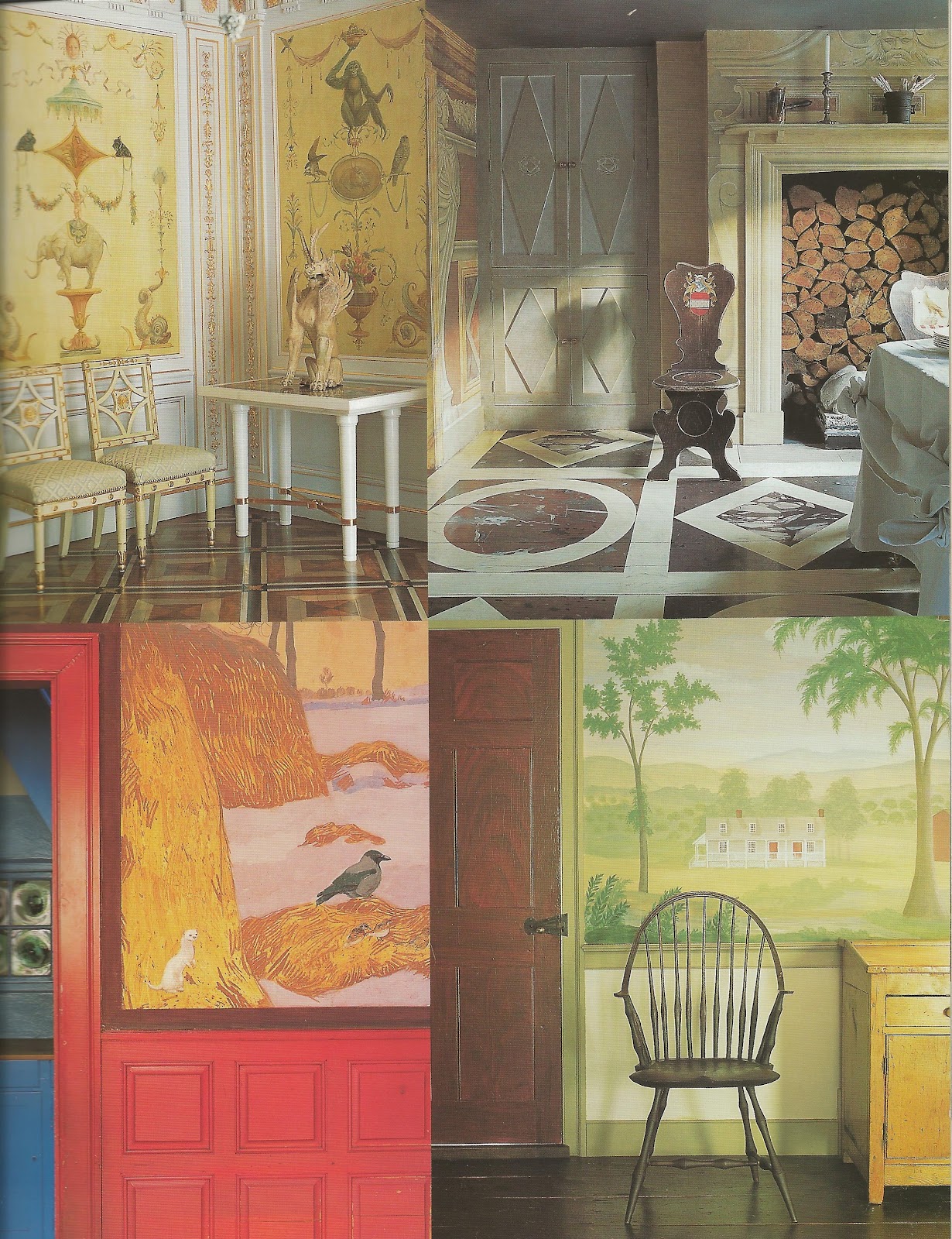
I have always loved this trompe l'oel powder room, from the book "Villa Decor" Decidedly French and Italian Style, by Betty Lou Phillips.  It was painted by Gillian Bradshaw-Smith, an amazing artist who has worked for many interior designers.


I really thought about painting something like this, but a friend is lending me her powder room to paint,  I want to make sure it works for her.  It is an amazing powder room, the floor and ceiling all painted as well.


Then there is chinoisererie, so very much blogged about and written about lately, there is no shortage of inspiration to pull from. \ Michael Smith uses a lot of deGournay wallpaper, I love his use of color.


I also really love panoramic, the french scenic is always beautiful.


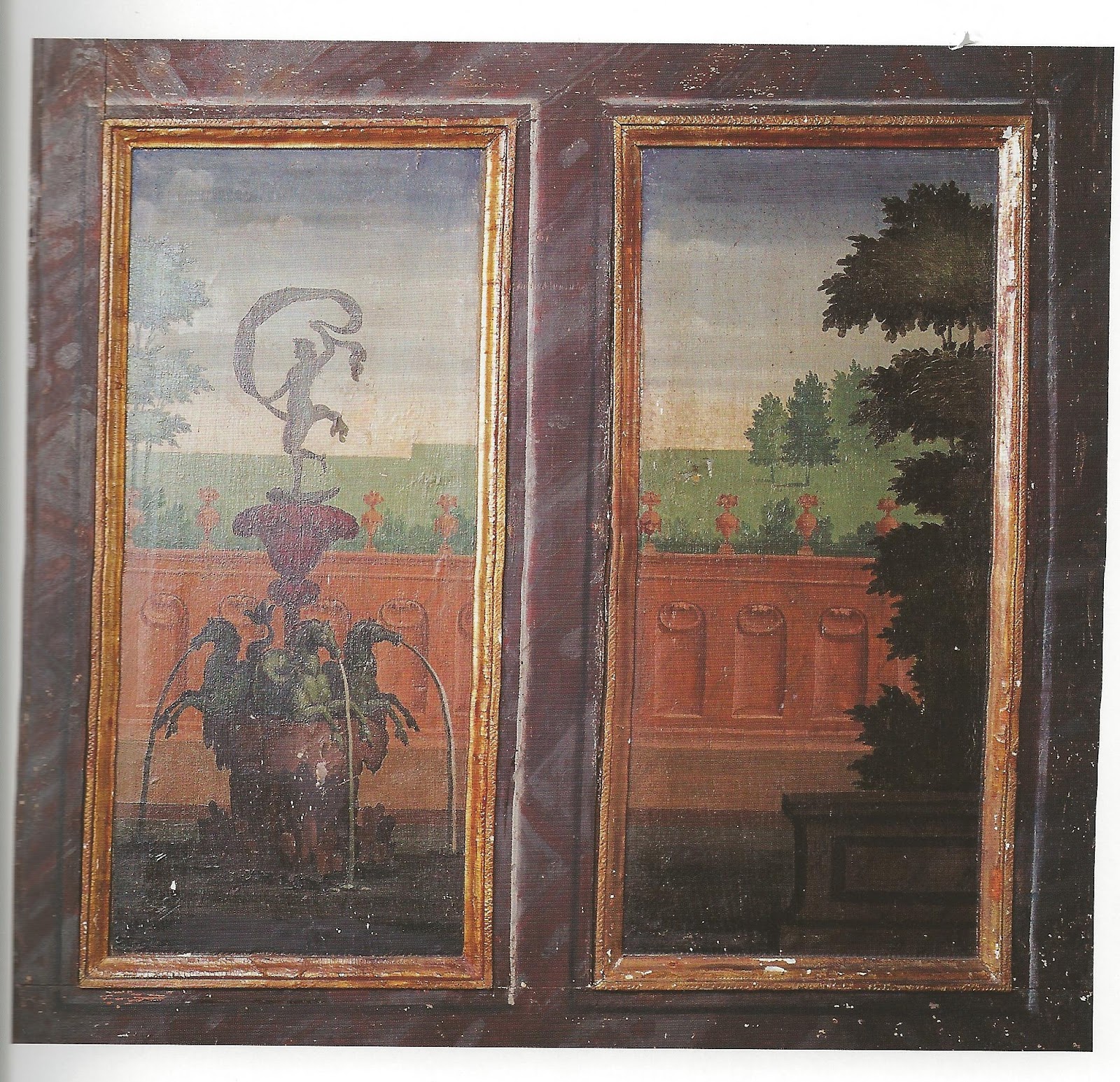
It might be a little easier to start with a couple of reproduction panels, rather than tackling an entire powder room.  I also definitely have a place for two panels to go in my house, flanking a mirror.  


Walls, by Florence De Dampierre


I also think grisaille is really nice, and might be a good option as the colors are more limited, so maybe a good way to start a large project.  


Walls, by Florence De Dampierre

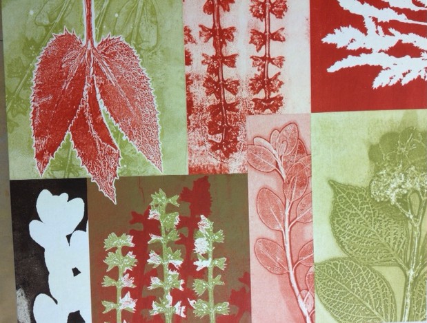
The colors really are soft and perfect for the design.  However, there is just something about more color, or at least a color story.


I think something like this is what I really had in mind, with the colors and the design.


So I am ordering blank paper, supplies tommorow.  I will try to post work in progress if it looks good.  I am diving in.  Yikes.


Tuesday, August 14, 2012

I attended a print workshop this weekend, on Vashon Island, near Seattle Washington, by a creative and talented artist, Mary Margaret Briggs.  Not only was it a gorgeous weekend, perfect summer weather on the island, but a really fun/ productive/ learning weekend as well.


We started by choosing plants from the gorgeous garden, and then using the plants, created prints.  We used
only a few colors, red, brown, orange, green and blue, to keep the range harmonious.  We printed the whole first day, explored the different textures different  plants produced, and adding colors, etc.  Here are a few of my favorites.


These were peony leaves, which really printed well!


Some others were pretty also, with blues and greens.  The textures are very nice.


A couple of my favorite are the oranges and browns in this plant,  Not sure what it is, but it's slightly velvety leaves are really pretty.


The second day we spent selecting our favorite prints, and working with them to create a nice collage.  I am super happy with how it turned out.  It is @ 20" x 24", and 2 inches tall.  (Gallery wrap style.)


Now, where to hang it...................................hope you all have a great Tuesday!   More information on the weekend workshops, go HERE.  For a video and more of her art and process, go HERE.
                     

Wednesday, August 1, 2012

Selecting and Hanging artwork


In todays post I wanted to look at the different and beautiful ways that designers display art in the homes they decorate.  Not only what they put up, but also how.  There are not any hard fast rules today about how to hang or display art.  It seems that every discussion I have had with anyone regarding hanging or displaying art in  home, always starts with "well it depends".  On many things.  For one, how amazing is the art?  I love this dining by Carolyne Roehm, in her country home in Connecticut.  The large dog painting, and 18th century portrait of "Billy, Holt Castle's Faithful Watch",  should be the center of attention.  The style matches, and compliments the interiors.


Color is another important factor.  Depending on how important or prominent the work is, the interiors should match the art.  Here, in another gorgeous Carolyn Roehm house, (from her book "A Passion for Blue and White) the interior color and texture choices were made to compliment the Jean-Baptiste Pillement painting, which was the inspiration for the entire room.


One of my favorite designers, Charlotte Moss, often hangs "collections" of art, in this case illustrations of homes, with the same color frame.  I love the fact that the pillow pick up the colors from the pictures.


But there can be a certain amount of seemingly "randomness" to displaying a collection, but I still think there needs to be some common elements, to make it work well.  In choosing the art, obviously it must be something loved, because we will typically look at it for a while.  Style of the home is not super important, if you love the art.


In fact I love the intentional juxtaposition of art work, that is very different than the style of the house, or the other art work.  Sometimes the reason it works is because it is so different.  In the case below, while the art home is very traditional, the art is very contemporary, yet the colors work together.  Beautifully.  (Photo from the the book "Decorating Master Class, the Cullman & Kravis way").


This room is largely oriental in design, yet the contemporary large ocean picture works so well.  The tan and blues in the room really set off the intense blues and greys of the painting.


Love the two different styles of art, they work with the color and texture of the sofa and pillows.  One of my favorites.


Another great antonym-type room with art, and I really like how this painting completely fills the space between the columns.


Of course, Chinoiserie needs no defining or justifying, it's just usually perfect.  The colors all work so beautifully, the soft blues greens and tans.


Next post I will explore the inexpensive ways to hang dramatic and fun artwork from unusual sources!


Monday, July 30, 2012

The passing of a great artist, Alex Rudinsky


I found out only recently about the passing away of a really great artist whom was my neighbor growing up, and was an inspiration to many.  

Alex Rudinsky 
Feb. 4, 1957 — April 21, 2011

                                             Alexander John Rudinsky

He died last year from a rare neurological disease.  I remember he had a great sense of humor, and was always cheerful.  When we were much younger, I remember going over to his house to see his sister, who was my age, and asking him to draw pictures of horses for us. I used to study his drawings of horses, and try to draw them like he did.  I wish I still had a drawing of his.

He and his family started the business called "Ceramica", which was the painting of the white ceramic objects, and then they would glaze and fire them.  This type of business is fairly prevalent now but I think he was one of the first to start it, at least around here.  He had several locations, and I loved going there and painting the ceramics.

I ran into him a few times over the years, here and there, and he was always very happy and very encouraging when he found out I was painting too.  he painted a lot of portraits, but also plein air.

A few of his paintings:


So sad, but he did leave so much beauty to look at, to remember.


Thursday, July 26, 2012

Pugs!

Hello, happy Friday!!!  I am so excited to be interviewed on the beautiful Enchanted Home Blog!  I am incredibly flattered, her blog is one of the nicest out there, and such an incredible person!  Talented too!  http://theenchantedhome.blogspot.com/.

Is it just me, or are there pugs everywhere?  They are such amazing little creatures, and in design, interiors and art extensively.  Their unique look is so nicely captured in many things.
One of my favorite, of course, is Tina (from Enchanted home's) dining  room chairs.  The pugs add just the right character.


I just love this photo which was the Dutchess of Winsor's bedroom.  A little difficult to see, but the pug doll-pillows s are amazing.  (Photo from Sotheby's, they have reproduced the dolls and sell them in sets of three, for $295).  http://www.jmvintage.com/gifts/pugpillows.html


Handbags as well, very cute.


Of course these cuties from The Shop at Enchanted Home grace my Studio table.  I love them.


One day, I just may have to have a real pug of my own.


No, not a pug.  My fur kid who was staring at me while I typed about pugs.  No need to be jealous little one, I still love you too.


Wednesday, July 25, 2012

Murals and wallpaper

I have always loved murals and wallpaper, chinoiserie, etc. I love murals that tell a story, and especially incorporate animals.  (Of course.)  This type of scenic, storytelling wall paper or murals has been dated as far back as the tombs of the Egyptians and Etruscans.


The ever classic Zuber wall paper, which is always beautiful, can be seen in the White House.
Zuber wallpaper was apparently on the walls in a Federal period house in Maryland.  The house was torn down in 1961, and the wallpaper preserved and installed in the white house. The company was started by Jean Zuber, Zuber Cie has maintained its headquarters at Rixheim, France.


Tioles and grisaile versions of scenes and stories are beautiful as well.  In fact the Brunschwig and Fils wallpaper and fabric, "bunny business" was in my son's room for years.  I kind of miss it.  (He's older now), and his walls are now red. (Sigh.)


One of my very favorite murals, is in the book "influential styles",  by Judith Miller, ( photographs by Simon Upton).  The chapter "Stories on Walls", show a gorgeous home, (NewYork home of Juan Pablo Molyneux).  The wallpaper panels incorporates the family pets. (You can see the mastif above the two statues.)  I love this concept, perhaps I may have to do something like that in my own home one day..................


Another view shows a pair of scottie dogs above the elephants.  The other animals add a lot of fantasy and an exotic feel to it.  


This mural has a nice painting of the outside of the house itself, which is another concept I love.  (Bottom right.)  The other views also show other beautiful wall paintings as well!


In further feeding my obsession with cinoiserie, and de gournay, always exquisite, I will definitely be painting something soon.........I will share when complete.  (Photo below form "Live, Love, Space").